Kontroltek Brand Refresh 2021
Celebrating 10 Years of Kontroltek
This also included the brand. The logo is based on a transistor symbol and the colours were chosen to help us stand out. Yes, we’re the purple company — a colour that is often associated with ambition.
So, that’s where the brand was at. And it hadn’t really been touched since, until a couple of years ago. As Kontroltek has grown, we’ve brought on new members of staff. This included marketing officers and designers, who had been given the go-ahead to modernise the brand as time moved on. Most changes have been subtle up until this point.
What’s New?
Okay, we include the following in our brand:
- Logos and crests
- Colours
- Typography (font)
- Tone of voice
And then some other things like personality, culture and service.
Brandmark
This is the big one. As we’re sure you can see, we have a new logo and crest. It was important to us that we modernised the existing logo without losing too much of its origin story.
The original Kontroltek logo is an adaptation on a transistor symbol, and we have further inspired the new symbol from this while bringing in a modern, responsive brand mark for Kontroltek.
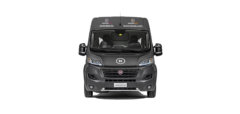
The new logo partners in nicely with new and future projects we have in the pipeline, including soon to be launching sister company, Kontrolmek.
Expect to see this on our website, social media, emails, uniform and vans soon.

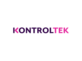
Colours
Kontroltek’s colour scheme has always been a unique wash of purples and pinks, but we wanted to look for some more contrast so we could make our design stand ahead of competitors. So, we added a deep, dark purple and contrasted it with a bright, neon pink. You won’t miss that in a hurry.

Typography (Font)
We needed a clean, responsive and recognisable font to increase our online presence and build a fast, accessible sight. Work Sans offered all of this with the addition of looking fantastic in large and small formats.
We feel like Work Sans helps our personality and service shine through. So, when you read what we write, you think that’s what we sound like too.
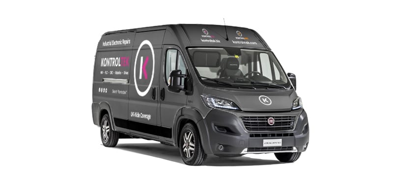
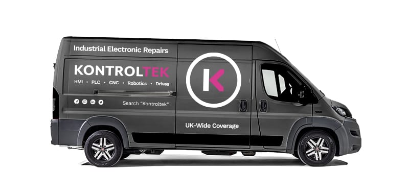
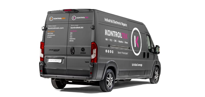
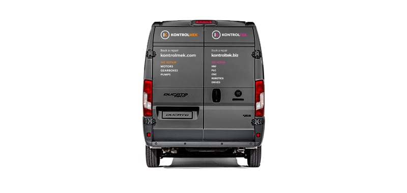
Van Graphics
With the addition of the larger vans in the fleet, we are now able to collect larger items from our customers with better fuel efficiency, minimising your costs.
They will all feature our simplified brand livery, and you definitely wont miss the neon pink.
Tone of Voice
By listening, Lewys could get a real feel for what Kontroltek was about. One of the things he learned was the way we talk. For example, customer support keeps it friendly but can bring out the jargon when needed. Engineers often get technical but like having a laugh too.
So, that language is our tone of voice. We hope it mirrors your day-to-day conversations at work.

Personality, Culture and Service
Kontroltek is and always will be a people’s business. We hire clever, friendly people and form great relationships with customers who work at manufacturers and help them solve their problems. Mainly, repairs.
Why now?
This year, Kontroltek turns 10 years old. It’s been a great journey and especially with the recent challenges of Brexit and COVID-19, we wanted to look ahead. Never waste a good crisis.
So, these changes in our brand only reflect some of the more tangible changes that are happening at the company. Hopefully, you like the new brand and customers of the future find it approachable and easy to connect with.